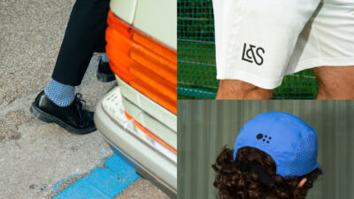
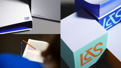
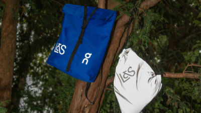
Lenz & Staehelin
How do you reposition a leading Swiss law firm with more than 100 years of history for the future? The rebranding of Lenz & Staehelin sharpened the firm’s positioning and made its international outlook visible. Inspired by the claim “The World’s Swiss Law Firm”, a distinctive new symbol was created by combining the Swiss cross with a globe. This visual language extends across all touchpoints, translating the firm’s values into a contemporary, confident and globally recognisable brand identity.
Category
Identity
Digital Design
Motion
Services
Corporate Design, Logo, Digital Design, UX-Design, Motion Design, Art Direction, Illustration, Signage,


Discover more cases